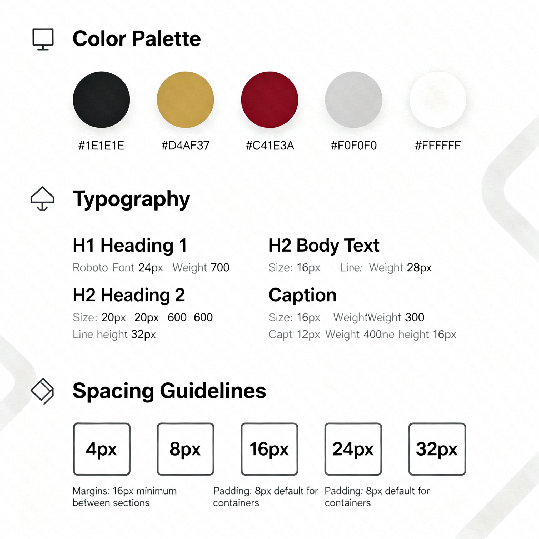
Claims information scattered across emails, phone calls, and paper documents, leading to critical details being lost or delayed in the process.
Hours spent copying information between systems, increasing the risk of human error and reducing time available for client service.
No centralized dashboard to track claim progress, making it impossible to provide clients with accurate status updates or identify bottlenecks.
Insurance brokers were spending up to 60% of their time on administrative tasks rather than focusing on client relationships and business growth. The existing workflow created a cascade of inefficiencies: delayed responses to clients, increased potential for errors, and frustrated staff members who felt overwhelmed by repetitive manual processes.
Our research revealed that 78% of brokers reported losing business due to slow claim processing times, while 85% expressed frustration with the lack of integration between their various software tools. This fragmented ecosystem was not just inefficient—it was actively hindering business success and client satisfaction.
Conducted 24 in-depth interviews with insurance brokers, claim managers, and support staff across 8 different brokerage firms to understand daily workflows and pain points.
Shadowed professionals for full workdays to observe actual vs. reported behaviors, uncovering hidden inefficiencies and workaround strategies.
Analyzed 12 existing solutions in the market, identifying gaps in user experience and opportunities for differentiation.
Facilitated collaborative sessions with stakeholders to align on goals and priorities
Mapped the complete claim lifecycle from initial report to final settlement
Categorized and prioritized issues based on frequency and business impact
Defined specific areas where digital solutions could create the most value
The research phase revealed three critical insights that would shape our design approach: users valued speed and accuracy above all other features, integration with existing systems was non-negotiable, and any solution needed to accommodate varying levels of technical expertise within brokerage teams.
Goals: Provide exceptional client service, process claims efficiently, grow her book of business
Frustrations: Spending too much time on admin work, difficulty tracking claim status, clients asking for updates she can't provide
Tech Comfort: Moderate - uses essential tools but prefers simple, intuitive interfaces
Goals: Ensure accurate claim processing, minimize errors, maintain compliance standards
Frustrations: Manual data entry errors, difficulty coordinating between departments, lack of real-time visibility
Tech Comfort: High - comfortable with multiple systems and eager to adopt new tools that improve efficiency
Goals: Accurate financial reporting, timely payments, regulatory compliance
Frustrations: Reconciling data across systems, generating reports manually, delays in payment processing
Tech Comfort: Moderate - values stability and accuracy over new features
These personas guided every design decision, ensuring that the platform would serve the diverse needs of different user types while maintaining simplicity and efficiency. Each persona represented distinct workflow patterns and technology adoption levels, requiring a flexible yet cohesive user experience.
Overview and quick access
New claim, details, history
Search, details, coverage
Payment, invoicing, reporting
We engaged 18 participants in interactive card sorting sessions, where they physically arranged various claim-related topics written on cards and sticky notes. Observing their arrangement strategies, as depicted in the image, revealed their innate mental models for organizing information. Through this hands-on activity, we identified three distinct organizational patterns among the participants:
This insight led to a flexible navigation system that could accommodate different user preferences while maintaining a consistent underlying structure.
The final information architecture balances user mental models with business requirements, creating clear pathways for different types of tasks while maintaining logical relationships between related information. Priority was given to frequently accessed items, with secondary functions organized in contextually relevant groupings.
Focused on providing immediate visibility into claim status, pending actions, and key performance indicators. The layout prioritizes the most urgent items while providing quick access to frequently used features.
Streamlined data entry with progressive disclosure, smart defaults, and validation to reduce errors. The multi-step approach breaks complex information into manageable chunks.
Comprehensive yet scannable information presentation with clear hierarchy and contextual actions. Related information is grouped logically to support user workflow patterns.
Initial wireframes explored various approaches to information density and navigation patterns. We tested concepts ranging from minimal, wizard-style interfaces to comprehensive dashboard views.
User feedback consistently favored designs that provided more information upfront rather than hiding it behind multiple clicks, leading to our current approach of contextual detail panels.
The wireframing process involved multiple iterations, with each version tested against real user tasks and workflows. This iterative approach helped identify optimal layouts for different screen sizes and usage contexts, ensuring the final design would work effectively across the diverse technology environments found in insurance brokerages.
Primary: Dark Charcoal (#333333) for a strong, modern foundation
Secondary: Fiery Orange (#E65100) for energy and urgency
Accent: Bright Red (#D32F2F) for key actions and alerts
Neutrals: ophisticated grays for balanced hierarchy
Primary: Roboto for excellent readability and modern feel across all content
Hierarchy: Six-level system from large headings to small captions
Spacing: 4px base unit for consistent vertical rhythm
Buttons: Primary, secondary, and tertiary variants
Forms: Input fields, dropdowns, and validation states
Cards: Information containers with consistent padding
Navigation: Sidebar, breadcrumbs, and contextual menus
The design system establishes a foundation that scales across the entire application while remaining flexible enough to accommodate future features and integrations. Every component was designed with accessibility in mind, meeting WCAG 2.1 AA standards and supporting users with varying abilities and technological setups.
Paper prototypes tested basic workflow concepts with 12 users, identifying major navigation issues and information hierarchy problems
Live system testing with 5 pilot brokerages provided real-world performance data and identified integration requirements
Figma prototype allowed testing of micro-interactions and form validation, revealing needs for better error messaging and progress indicators
Final round of moderated sessions with 15 participants validated the complete user experience and identified remaining friction points
Each testing phase revealed specific areas for improvement, from minor interface adjustments to fundamental workflow changes. The iterative approach ensured that user feedback was incorporated throughout the development process, resulting in a solution that truly met the needs of insurance professionals in their daily work environment.
Centralized view of all active claims with status indicators, priority flags, and quick action buttons. Real-time updates keep teams synchronized and clients informed.
Comprehensive claim information with timeline, documents, communications, and stakeholder information all accessible from a single, organized interface.
Complete policy information with coverage details, renewal dates, and claim history. Integrated search and filtering make finding specific policies effortless.
Real-time visibility into payments, reserves, and settlements with automated reconciliation and reporting capabilities that eliminate manual calculation errors.
Comprehensive financial dashboards with customizable date ranges, automatic calculations, and export capabilities for seamless integration with existing accounting systems.
AI-powered claim routing and prioritization based on complexity, value, and urgency, ensuring critical claims receive immediate attention while maintaining efficient workflow.
The final interface represents a careful balance between comprehensive functionality and intuitive usability. Each screen was designed to support specific user workflows while maintaining visual consistency and efficient navigation patterns. The responsive design ensures optimal performance across desktop, tablet, and mobile devices, accommodating the diverse working environments of modern insurance professionals.
Average time from initial report to resolution decreased from 18 days to 6 days
Data entry errors and miscommunications virtually eliminated through automated workflows
Reduced administrative overhead and improved efficiency across pilot broker network
Post-implementation surveys show high satisfaction and willingness to recommend to colleagues
This platform has transformed how we work with our clients. What used to take hours now takes minutes, and our clients are amazed by how quickly we can provide updates and resolve their claims. It's not just a tool—it's become essential to our competitive advantage.
— Sarah Chen, Senior Broker at Metropolitan Insurance Partners
This project demonstrates the power of user-centered design in transforming complex business processes. By focusing on real user needs and iterating based on continuous feedback, we created a solution that not only meets functional requirements but genuinely improves the daily work experience for insurance professionals. The project’s success has established a foundation for future innovations in the insurance technology space, proving that thoughtful UX design can drive significant business value while enhancing user satisfaction.